Are you confused by all the terms Web Designers use when referring to sites that are Mobile and Tablet friendly? Are you concerned about the cost of a Mobile Friendly site?\n\n
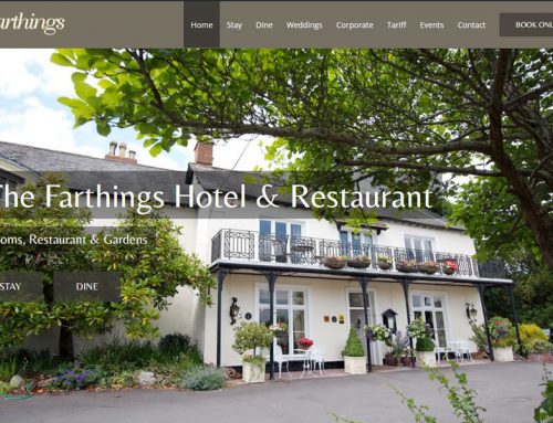
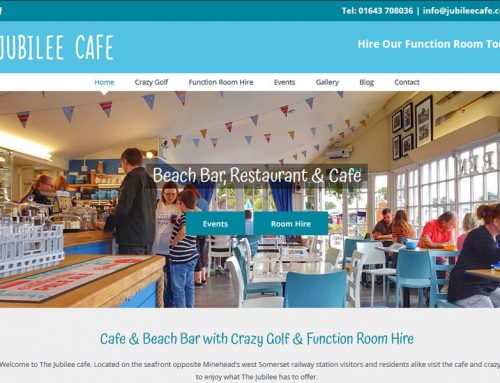
Generally, all mobile sites are responsive.This means that they respond to as certain aspect of the device for which they are being viewed on, and display the content accordingly. Most web designers, including us here at Somerset Web Design, will set a responsive site to use a device’s screen width as a basis, which will mean that specific styles can put added to the content for solely mobile and tablet devices.\n\nThe only issue with using responsive design this way, is that the content of your website will always show, exactly as written, which can mean a few issues in the order of items when on a mobile, or the page taking to long to load. To resolve this, developers go one step further and create Adaptive Content.\n\nThese are responsive websites that respond to the device type, rather than its width. Adaptive websites will look at your device, and determine whether it is a mobile, table, or computer, and can even tell if your on an iPhone, Android, Windows or Blackberry phone. This means you can load individual content for specific devices only, which keeps page size down, meaning load times are kept to a minimum.\n\nHere at Somerset Web Design, we use Adaptive design in combination with a customised WordPress experience to make your site as simple to use and edit for all devices as possible, whilst keeping costs to a minimum. For Example, our site loads a smaller version of our images, to minimise page size and load speed. We also adjust the layout of some of our content to better suit a smaller screen.\n\nGive us a call on 01823 726077 or Contact Us Online, and see what we can do for you.